Note: This is Part 2 of my Gallery Wall Diagnostics series. Here’s Part 1.

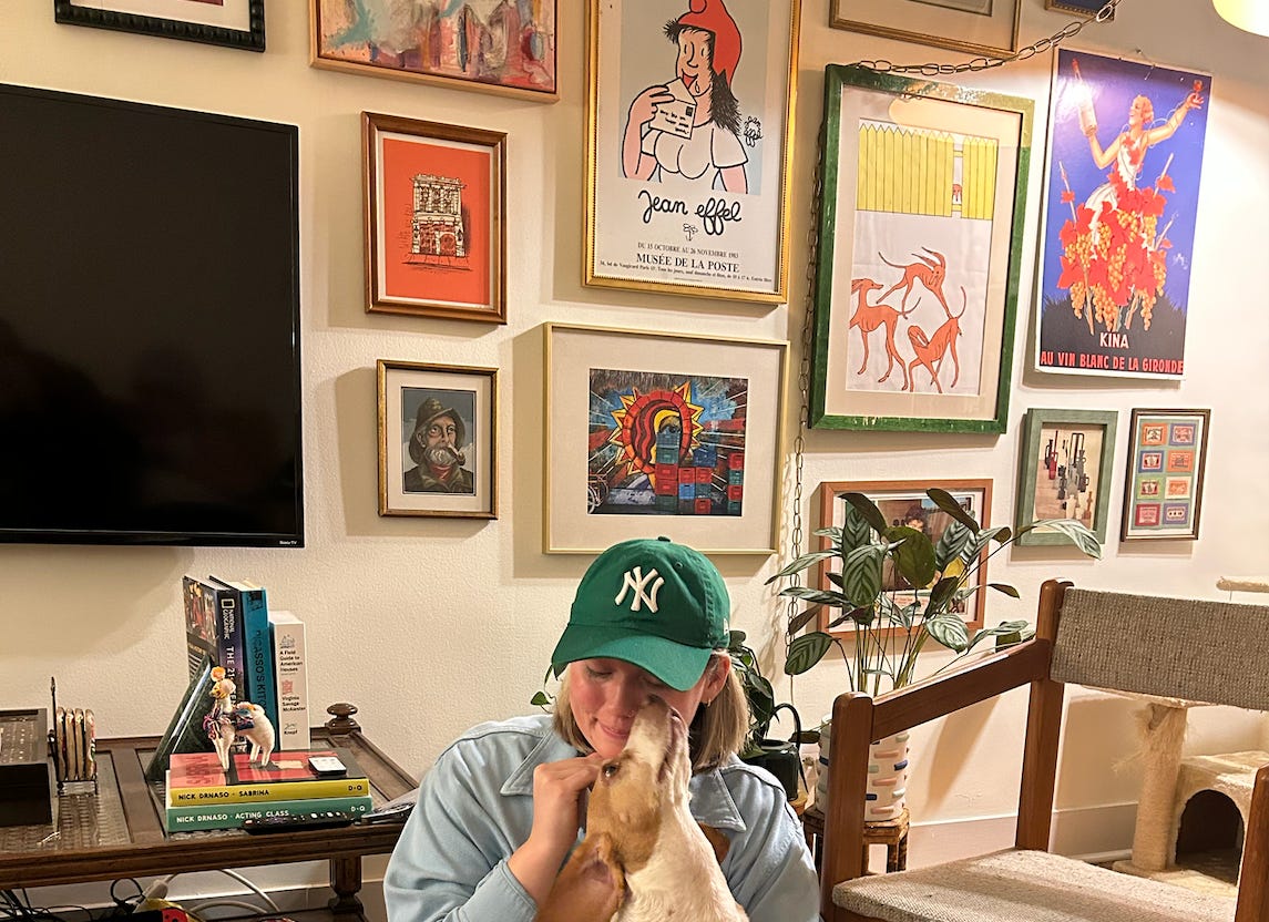
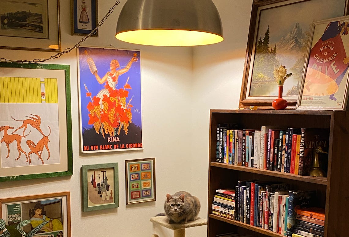
By the time you’re reading this, it’ll be Valentine’s Day, and I will most likely still be violently menstrual. I got blood pouring out of my ears and shooting out of my toenails this week, boys! Mundane tasks feel Sisyphean. I keep forgetting to close cabinets. As I write this, I’m watching the cat chase a bug, which means our bugs are back. Aesthetically, I’m like this:
Anyway: How’s your gallery wall?
your gallery wall’s fatal flaw, pt. 2
Last week, I outlined a few common issues that hold folks back from creating a truly miraculous gallery wall. If you’re still squinting at your gallery wall unable to figure out what’s not working, it could be one of the following issues:
You’re going for a uniform look, but don’t have uniform measurements.
Last week, I touched on the importance of measuring the space between gallery pieces. This is important for any sort of gallery wall, including my preferred eclectic style. Even if you’re working with lots of different sizes and shapes, they should be spaced evenly. But if you’re going for a super-uniform look, like this blogger’s minimalist photo grid, even spacing is imperative.
Fortunately, there are ways to achieve this without wanting to leap off a bridge. This week, one of my colleagues shared a very hot tip to hang a uniform gallery wall: She hung a piece of gridded wrapping paper on the wall, then hammered the nails directly through the paper. This allowed her to drive the nails at precise intervals without having to measure one million times. After all the nails were in, she simply ripped the paper off the wall. Genius! This is an act of genius!!! Here’s a similar tutorial.
You’re afraid of scale.
This one is huge. Looking at unsuccessful gallery walls, I generally see two major issues with scale. First, someone might have too many small items crammed haphazardly into a single gallery, like so:
Alternatively, your gallery may be too small for the wall it’s occupying, like this Redditor. The effect is random, cluttered, and disorienting.
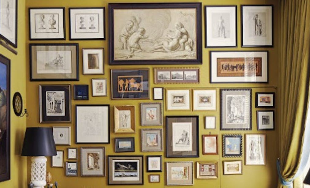
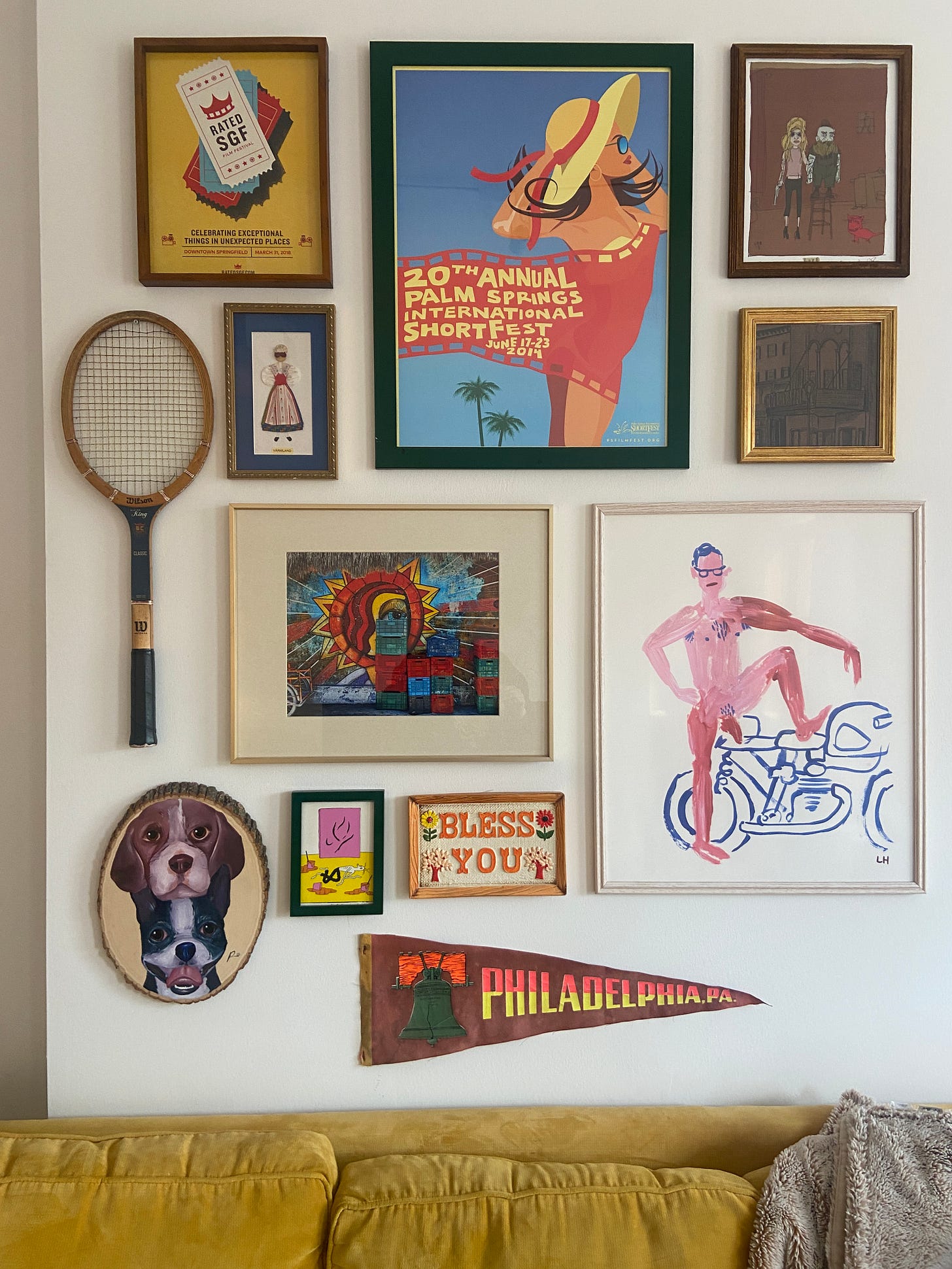
Instead, I recommend going big. You want the viewer’s eye to sweep over your gallery, taking it in as a single, cohesive display. Play with pieces of different sizes, with larger pieces anchoring the center of the display. LIKE SO:
Similarly: You got small stuff in the middle and big stuff on the edges.
No! Instead, put large pieces in the center of the display, using smaller pieces to fill gaps and create a cohesive border around the display.
thanks for reading! here’s YEAH, BABY, YEAH, our regularly-scheduled roundup of little treats:
Here’s what I love this week:
The folks at BHLDN FiDi: I’m, like, eh, a size 10–12, and bought my wedding dress over the weekend. I love my dress, but I am also weirdly very sad to be finished dress shopping. It’s fun! Even as a midsize person who, while not generally limited during in-person shopping, had a hell of a time finding a bridal stylist who knew how to cram me into a dress. At one shop, the stylist had me hold up the dresses to cover my boobs and told me to “use my imagination” in lieu of clipping me into the gowns. Boo! Enter: the stylists at BHLDN FiDi. For context, every other store forbids you from walking the racks or touching the dresses, I guess in case you’ve just eaten a barbecue lunch. But my BHLDN stylist wanted to make sure I tried on every single dress that interested me even a little. And I bought one! And the matching veil! Nice!
Kozy Shack rice pudding: Perfect snack, best eaten with tiny spoon.
Os Mutantes: My cool coworker recommended these guys last week, and I realized that they’re heavily featured on my favorite record of all time. I love winter, but if you’re not feeling it, Brazilian Tropicalia is the quickest way to warm up, strictly from an audio perspective.
Tony Tulathimutte’s REJECTION: Perfect book. Just a perfect book. I started it two days ago and I’ve gobbled it right up like a perverted little snack. Yum yum yum.
Lil


